REWE UI vision
Imagining the what-if's for a UI layer bogged down by legacy dependencies.
The challenge
Striking a balance between a design refresh and meeting the user expectations, while future proofing the work approach. I slimmed the UI down for fast dev cycles, re-built the components with accessibility compliance and set constraints for style usage.
Success scenario
“REWE UI is accessible, minimal, clean and invisible for the services that we offer to our users. Every action is immediately recognizable and obvious at every step in the journey.”
Context
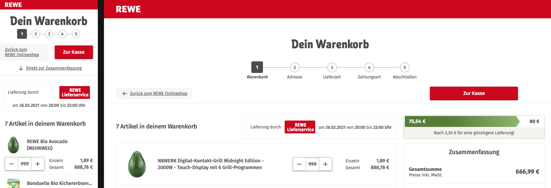
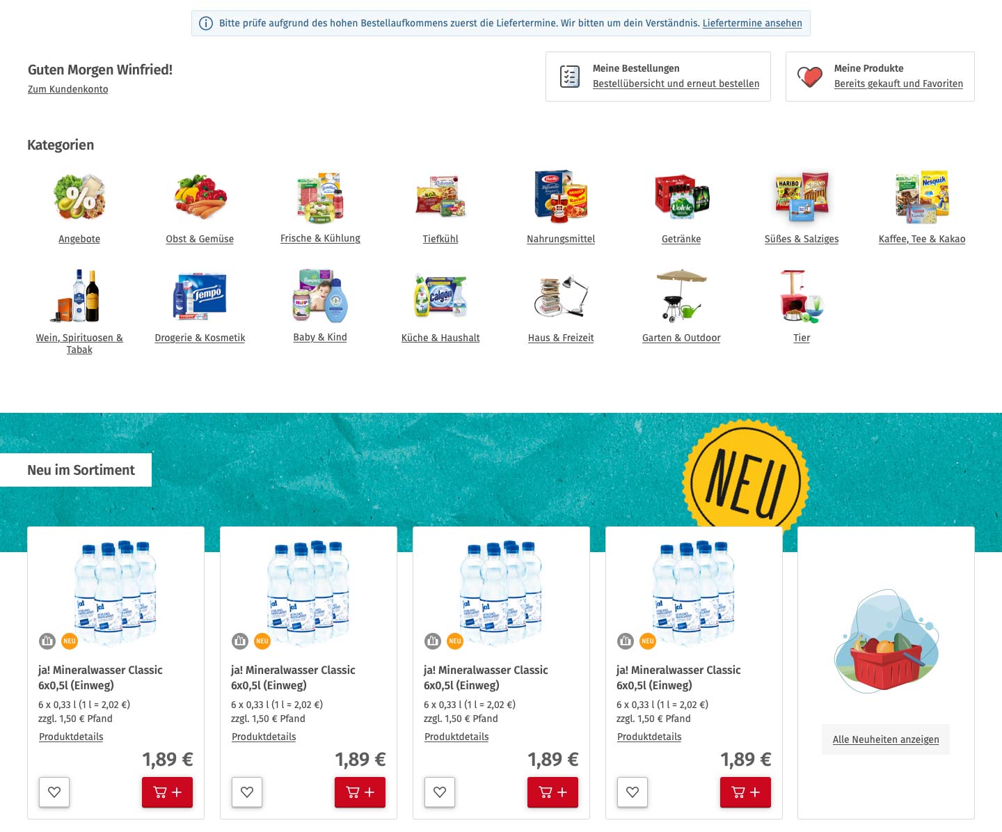
After working on the various parts for REWE for years, it became very hard to introduce any meaningful updates to the experience. User sentiment was conservative, any small change was met with scepticism. The target audience did not like to learn new conventions, any refresh had to match the well established habits.
The team agreed on setting aside one week for every designer to come up with their concept of a total refresh for the UI. This was also a chance for everyone to push what was important to them, for me it was what we were so dearly lacking: Structure, accessibility, affordances.
Approach
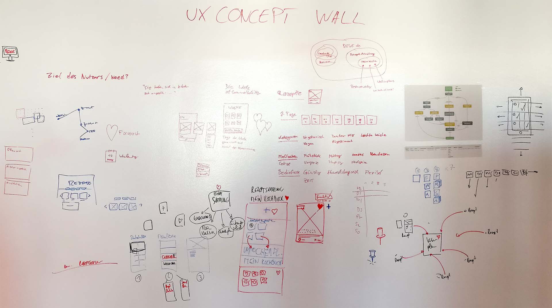
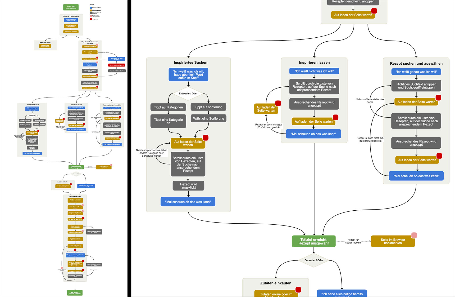
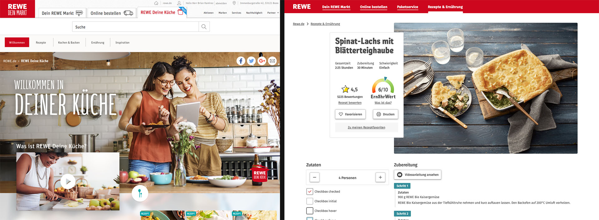
I drew my thoughts on a wall in the office to get the holistic picture of what needed attention. I extended the concept with a user journey map for the recipe section, from appetite to serving a meal.
Accessibility first, bias last
Even though they are quite well thought out, it is not enough to blindly follow the WCAG 2.1 guidelines. Designers need to mind the parts of society that may depend heavily on the services that they design. For online groceries, that’s almost every adult. Average life expectancy in germany currently is 79/83 years, tendency rising.
Let’s take my mother-in-law as an example: Woman in her 60s, technology novice, uses her smartphone and laptop for communicating with her family and some online shopping. Recently I asked her about her online shopping in general and what her experience with navigating different UIs is.
“I never know where to tap, so I just tap everywhere. This mostly works. Mostly it’s frustrating.”
The statista data tells us that she will tap on UIs for at least the next 23 years, hopefully more. I want to design UIs for people like her, UIs that do not frustrate users for decades.
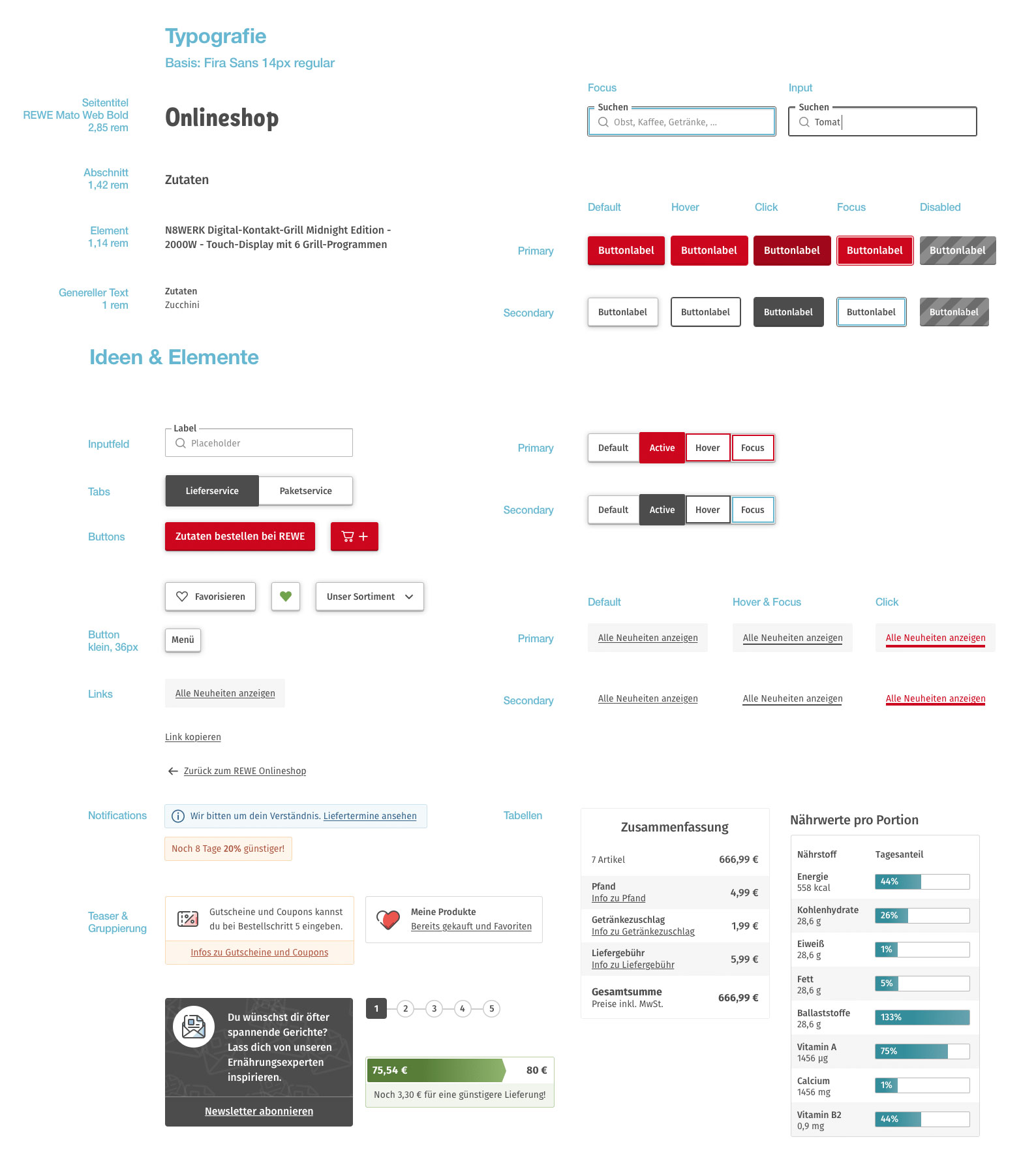
Resulting structure, accessibility, affordances
My goal was to not waste a single pixel and style decision on decoration. The envisioned UI is completely at service to the user and gets out of the way. In total 4 text styles were used: Title, section headline, label, copy text. Interactive elements are recognizable by their silhouette.