Backstage by Spotify
Unified Spotify's dev portal UI, resulting in increasing sign-ups from a handful to over 2000 a month.
Tl;dr
- Increased sign-ups from a handful to 2,000+/month by unifying Spotify’s dev portal UI
- Built and owned the foundations for Backstage’s internal design system
- Audited and documented the full UI landscape across hundreds of plugins
- Led the design consolidation effort across plugin teams
- Built and owned the future vision as contributor and facilitator for the team


Success scenario
“All creators for Backstage are enabled to build their interfaces and experiences to a single cohesive ideal and use the supporting artifacts to ship faster, reduce repetition and improve their software quality.”
Methods used
- Presenting a complete audit of every UI component and pattern across the Backstage instance, highlighting experience divergence and ambiguity.
- Detailed flow analysis of journeys that crossed multiple plugins in Backstage.
- A design intent framework: the shared reference defining what each primitive is for. That gave creators a common language.
- Page-level redesigns demonstrating the framework in practice, including a proposed information architecture.
- A visionary UI direction, developed with a colleague, that brought Backstage closer to Spotify’s Encore design language and gave designers something to rally behind.
The flow analysis was a turning point. When I showed designers and leadership their journey experiences stripped down to layout and intent, the confusion became impossible to ignore. Every person in the room had what one director called a “lightbulb moment.”
Backstage had grown organically over the years into hundreds of plugins built by autonomous teams, each making their own UI and flow decisions. The result was a fractured experience, with redundant components, inconsistent patterns, and widespread accessibility gaps. I led the effort to bring coherence to this landscape.
The problem in detail
Internal tools rarely get the attention they need until accumulated debt starts crushing productivity. Backstage was built to solve real developer pain points. Context switching, repetitive tasks, secondary maintenance overhead, infrastructure bloat. Its flexibility was also its weakness. Every team could build their own plugins, and most did. The number of active plugins grew into the hundreds while only a fraction stayed maintained.
The second issue was the strong isolation of plugin teams into verticals. The teams themselves were working as intended, high-performing experts iterating on their software, shipping independently. Separate requirements, user goals and targets led them into building highly complex software pieces of their own, which blocked the scope to extend to the wider Backstage platform, leading to a divergent landscape of tools under one umbrella.
A single journey across backstage might lead you through these experiences:

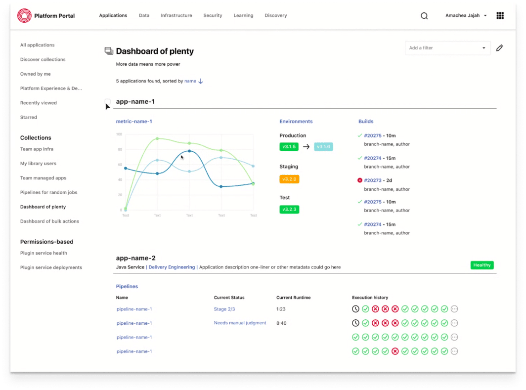


Every single one very complex and opaque on its own. Facing this and trying to get your work done was daunting to users, this was the main cause of backstage being deemed too hard to use for a wider organization. It cornered itself into the developer tooling space, which for some weird reason gets a pass on usability for complexity. Users were encountering the same components across one journey, but they would behave differently at every step of the way. Navigating and using Backstage became so hard, that someone had to onboard you into the specific jobs and teach you where to click, as it was just not possible to discover every functionality on your own.
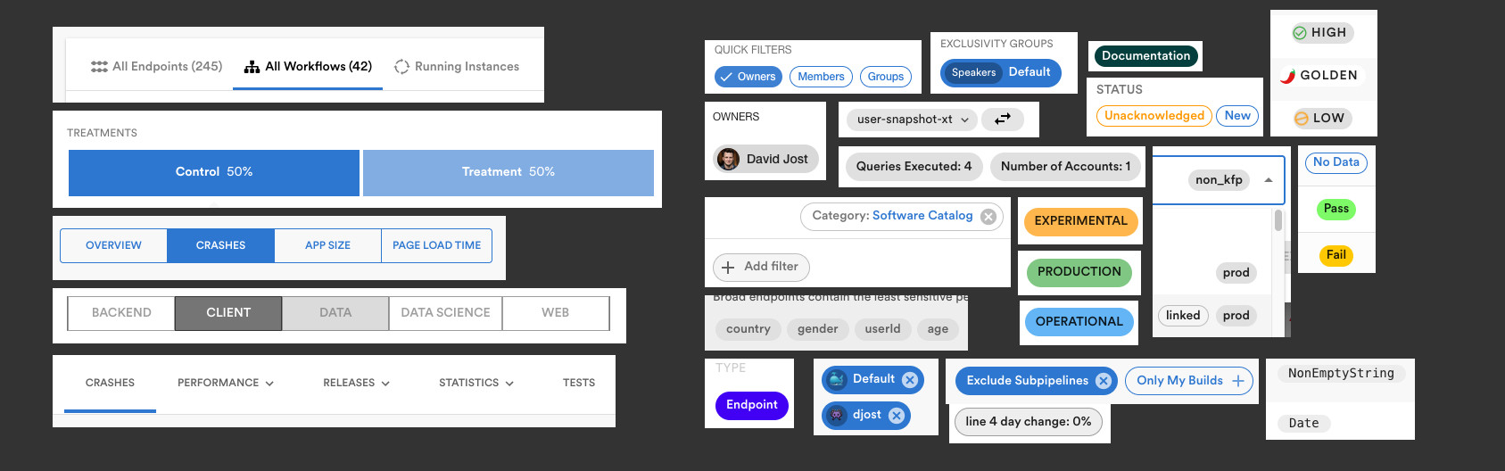
This separation of plugins meant the same wheel got reinvented constantly. Tabs, chips, and other core components existed in dozens of arbitrary variations, each carrying its own maintenance debt. There were as many component libraries as there were designers, and most were kept private. As my design director put it:
How I approached the solution
I started by using Backstage as a new user would, cataloguing every component and pattern I could find. I noted naming conventions in code, visual variations, and functional inconsistencies. The resulting collection made the scale of divergence undeniable, and for the first time, visible.

From existing research, I pulled a prioritized list of engineer pain points. The most pressing: “Lacking guidelines on user-centric design.” Creators needed a central reference, not another library.


Aligning designers before aligning pixels
The few existing shared libraries were out of date and unmaintained. Research interviews with designers revealed the full extent. Every single one had built their own private collection of assets, picked from arbitrary sources and customized to their needs. Almost none were shared.
Before presenting any new visual direction, I needed to get designers asking a different question. Not what something looks like, but what it is actually for.
I set up extensive page analyses to map the full landscape of layouts and arbitrary UI control placement across Backstage. When I showed designers and managers the interfaces simplified like this, it was impossible to ignore. Suddenly it was obvious why Backstage felt so confusing.
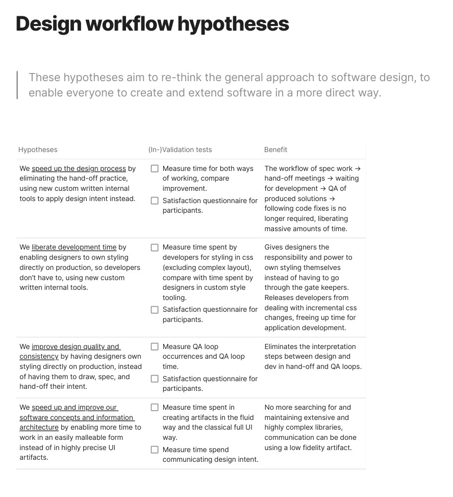
I built a reference table mapping user intent to component purpose. It documented what each primitive is for, not just what it looks like. Think of it like language. You can be expressive in how you apply the rules, but you have to follow them for your message to make sense to the receiver.

Visual identity exploration
Designing for Backstage felt like a designers dream: a complete mess to build upon, free reign on visual style, finding the balance of style and substance. Raising it up to modern standards while still keeping its identity of developer tooling, as this is the main target user group.
Then I redesigned the now modular UI to demonstrate the framework in practice, including a proposal for a new information architecture and navigation.
The teams picked this system up with my guidance and documentation, and started to re-organize their frontends to meet the new styling and sensible component usage.


Spotify now had great momentum going, there was movement visible from Backstage with the backing of a giant, so the business customers took notice. Sign-ups skyrocketed from ~6 to over ~2000 per month. We were flooded with requests for demos, internally the other plugin teams all wanted in on the success and adapt their interfaces as well.
The sad turning point
It was the end of 2023, and Daniel Eck was on a spree of efficiency, as he called it. Over the year, he first fired 200 people in one business unit, over the summer 600 more in another, until finally 1700 more right before christmas. In a later townhall he even said, and I quote here: “Maybe I have been following the band wagon too blindly, everyone was doing layoffs so we needed to as well.” A cynical end to our efforts on Backstage, many of my colleagues (who have been at Spotify for years) and me were laid off, our work not continued.
