Immersive platform strategy
Re-directing the product towards goal-driven, autonomous value creation
Tl;dr
- ~35% Increased active user rate by shifting customers from support-dependent to self-directed value generation
- Raised average engagement from 6 to 34 minutes by introducing tangible benefit experience
- Liberated ~20% of CX capacity towards high-leverage work
- Full ownership of the design strategy
- Built and presented the new vision direction live on stage


Success scenario
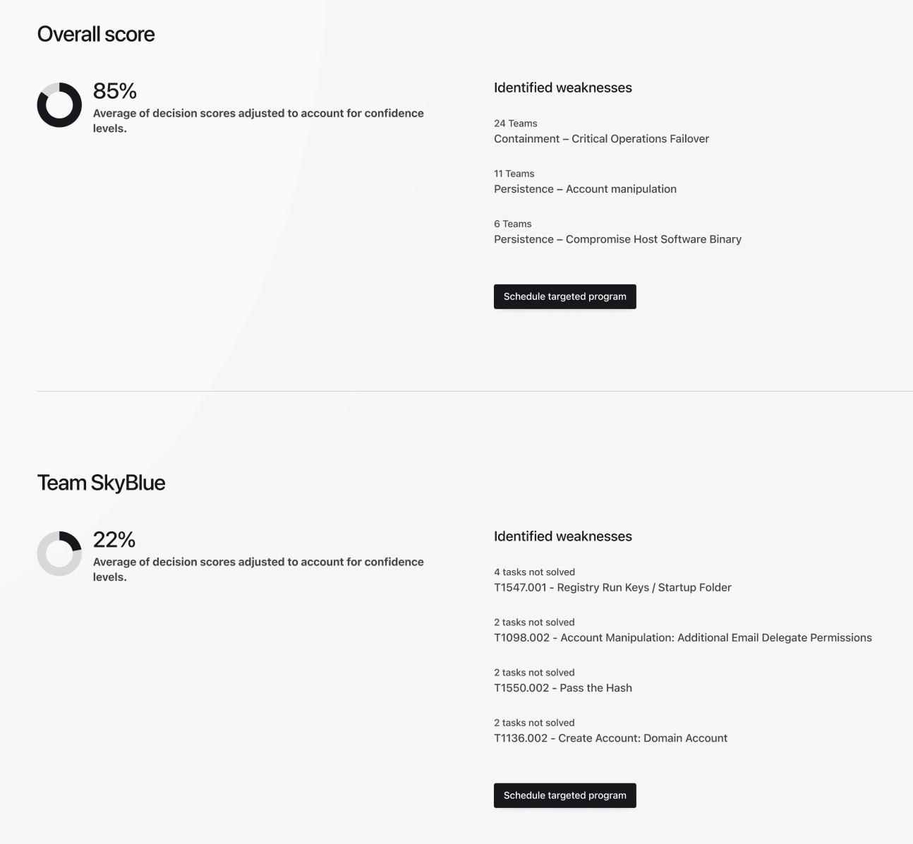
“The human edge of cybersecurity is honed on Immersive’s training platform, where 400+ enterprise customers autonomously track and validate their progress: learners complete targeted exercises, line managers see team readiness at a glance, and CISOs have a clear and current view of their organization’s cyber resilience, no support briefing required.”
Methods used
- Auditing the platform information architecture for all user personas
- Qualitative user research and shadowing customer support to understand capability gaps
- Iterative design with heavy use of prototyping and quick testing cycles
- Strategy roadmap alignment with CPO and leadership group
- Facilitating and presenting product vision to the entire organization live on stage
The key piece to understanding the product gaps was dogfooding the offered training analysis. The answer to the big question of “why are customers dropping engagement?” became obvious once I laid out the reality of the value the platform was supposed to deliver.
The problem in detail
When I joined the product suffered from a clear lack of strategic direction. It was evident across the entire platform: some new great feature was built with no plan or sensibility of how to integrate it to reach its goals effectively, it was all arranged haphazardly, in order to ship quickly.
Navigating through the platform became a scavenger hunt, as functionality was localized and hidden beneath layers and layers of nested links, tabs, and dropdowns — depending on license level. The issue for users was multi-dimensional. CISOs, managers and learners were not served the same platform UI and were often confused by what they should pay attention to, as arbitrary elements just would not show up for them.

Immersive was 300 people strong, 8 years in the business and transitioned from a startup into a scaleup company. I was in charge of leading the design function at Immersive, managing the people as well as contributing to the product landscape.
The platform was so hard to use, that the customer support team had to deliver the promised value to the customers by hand: They became the translators who collected the data from the platform and built a story slide deck out of it to present to the customers bi-weekly.
The customers themselves didn’t even bother logging in anymore. And the licenses were NOT cheap, depending on the seats it could easily reach into six figures.

How I approached the solution
I first mapped out the upskill loops for the different personas, “what is the loop they should run through every visit to step closer to their goals”. I ran several workshops with our subject matter experts and interviewed several CISOs via videocall about their goals and motivations.
Relying on customer support did not scale the business, as there were limited CX experts available. So I convinced our CPO that we needed to shift the entire platform strategy towards working as autonomous value creation for our customers. “Sounds great, how do we do that?” he said, so I presented the first iteration of what the core value loop should look like.
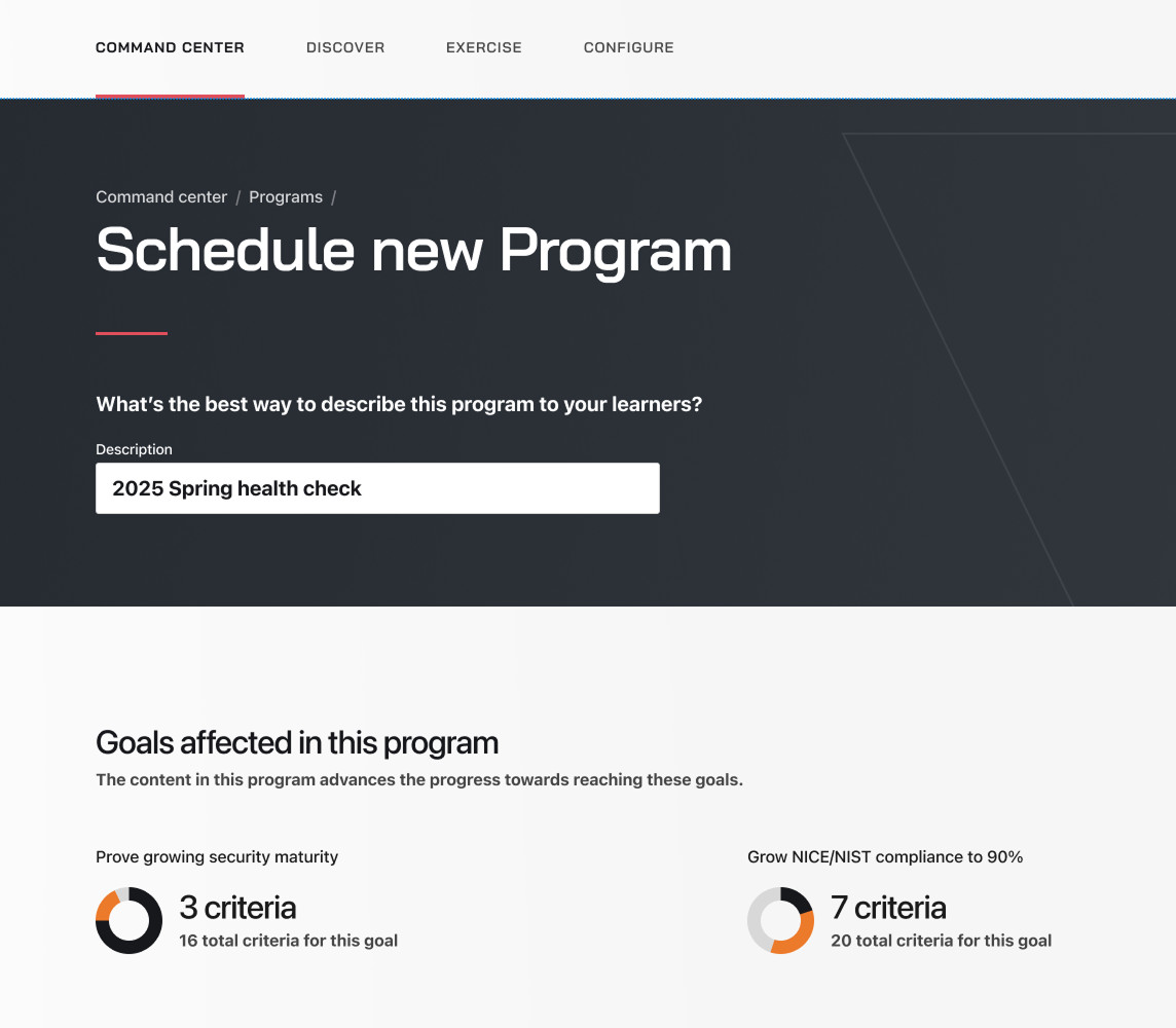
In all my research one thing always came up again and again: the lack of clearly stated goals, internally as well as for our customers. In the concepts I explored how to set the goals as the core communication piece and how the customers’ progress on the platform paid into reaching their goals.

This was the lightbulb moment for immersive, now they saw what the customers needed and how bad their current platform was at delivering it. Almost like the metro, this map let any user jump in at any point in the platform. They followed the guides and eventually ended up at the start again, having completed at least one value loop. We tracked their progress, presented their improved metrics and let them experience their improvement themselves, no customer support required.
Updating the user flows
The concept was sound, now we worked on the newly adapted journeys. I iterated on the flows in collaboration with the principal PM and CPO, together we figured out how to best guide the users according to my value loop idea.
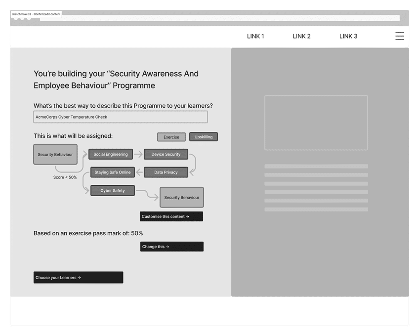
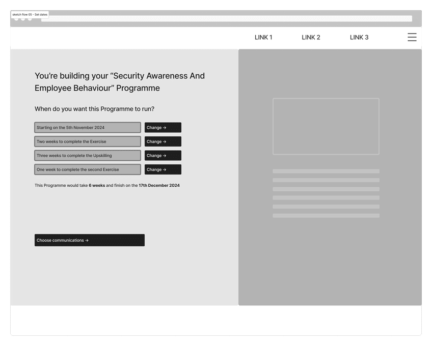
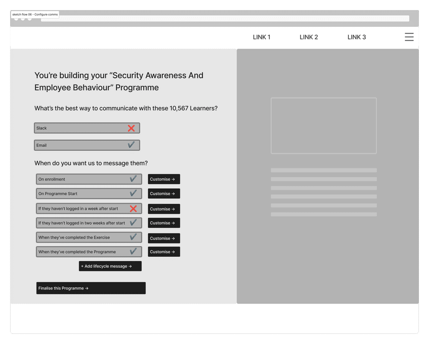
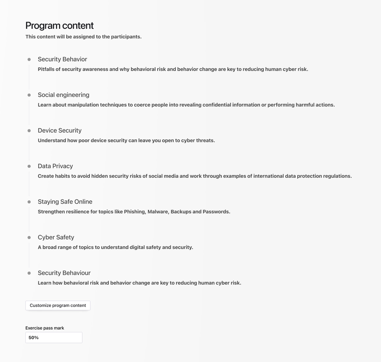
The focus in these wireframes is on the program of training that is being applied, based on the needs and gaps that were identified in the customers’ workforce.


Final designs for the self-directed flow
After many iterations we arrived at a set of steps that enables users to schedule their goal-optimized training program. This is the extreme opposite of the endless pages and overloaded UI of the old platform, now the details and controls are the main focus.
Exploring cyberspace
On the visual side, I explored the cyber and gamification aspects. What could we do in terms of playfulness and effects, to shake off the “white material table” look from the platform? This exploration prototype was a massive hit with the teams, as it directly challenged our main competition, who were so far doing a far better job in these regards.
I went so far as to re-think the login for the platform: As this platform is for security experts, why not offer a terminal for them to hack their way in? This was a little game that I prototyped, which our testers loved. You can play it on my side projects section.

Immersive was going through a re-brand at the time, so we aligned the visuals with this new brand. My work on the information architecture solved the pain points of bad navigation, missing signposting, too much UI everywhere, too many styles all at once. This new version told you exactly the current state to be aware of, how you were progressing towards your goals and what you needed to do next to advance.
In our usability testing sessions we saw that users were immediately setting goals and moved towards completing learning exercises, exactly the thing they needed to do to get the value they paid for.


